FAT BOY COFFEE CO.
Project Type Responsive Website Design
Role Researcher & Designer
Tools Figma, Adobe Illustrator
The Project
Fat Boy Coffee Co. needed a responsive website designed to work seamlessly across all platforms. The site required features including a menu, the ability for customers to order and customize food and drinks online, purchase merchandise, and display the café's hours and location. I researched, designed, and tested the product to ensure it met all these requirements, providing a user-friendly experience for customers on any device.
BACKGROUND
In a world of ever-changing technology, more and more people are depending on websites to find information and order goods. Especially food and drink. There are many different ways to make and buy coffee, including coffee shops.
When choosing a coffee shop, there are many factors to consider: Chain or local, location, quality of product, ambiance, ethics practices, etc. More and more, consumers are preferring local shops over chains such as Starbucks due to better coffee, customer service, and overall ambiance. The trend of ‘hip’ workspaces has remained prevalent, even in a post-pandemic society.
Mobile and online ordering has continued to thrive in the food and beverage space. Many consumers are turning to mobile ordering and drive-thrus due to the convenience they offer.
SECONDARY RESEARCH
Quick Facts
•Around 75% of Americans report being coffee drinkers with 49% drinking coffee daily.
•Only 7% of coffee drinkers have reported never ordering from a shop.
•Studies show there has been a 46% increase in coffee mobile ordering since January 2020.
Competitive Analysis
Audience
A wide variety of people are coffee drinkers, with retirees being the largest group. Most people say they drink coffee for the taste, however, many enjoy the benefits of the energy boost. Younger generations are more likely to order online than older generations.
PRIMARY RESEARCH
Questions
•What factors do you consider when choosing a coffee shop?
•How often do you buy coffee from a shop?
•Do you prefer chains or local shops?
•Do you sit/work inside coffee shops or only stop in to buy a drink?
•What do you find difficult about ordering a drink online?
•What do you like when ordering a drink online?
Research Synthesis - POV & HMW Statements
I’d like to explore ways for busy customers to easily order their favorite drinks online because it can take a lot of time to order and customize a drink.
How might we help customers save their favorite drinks to easily order in the future?
I’d like to explore ways to easily show adventurous customers the seasonal food and drinks offered at the shop because it can be difficult to know what is being served at a shop.
How might we display the seasonal food and drinks for customers to easily see and order?
I’d like to explore ways to help young college students choose how to pay for a pre-ordered drink because many prefer to pay with cash rather than a card.
How might we display the various options to pay for an online food/drink order?
User Needs
•Want to be able to see specials/seasonal menu items
•Being able to save/favorite drinks or food options.
•Way to easily customize orders.
Pain Points
•Many feel that when they order online, their drink is not ready.
•Online ordering is inaccurate to what is available.
•No option to pay at the shop.
Personas
PRIORITIZATION & ROADMAPPING
Project Goals
Features
Sitemap
User Flow
Task Flows
BRANDING
Fat Boy Coffee Co. wanted a design that was both trendy and bold, incorporating a mix of modern elements and organic, hand-drawn illustrations. The color palette was carefully selected to include classic neutrals such as tans and navies, complemented by pops of bold colors to maintain a contemporary look. This combination created a striking yet harmonious aesthetic that aligned perfectly with the client's vision.
UI & VISUAL DESIGN
E-commerce websites involve a lot of information, so my goal for Fat Boy Coffee Co. was to create something that users could easily understand. By incorporating dropdown menus and organizing products into various sections, I was able to limit the noise and information overload users might experience. This approach helps users process information more efficiently, making them more likely to purchase products and return for future visits.
UI Kit
WIREFRAMES
Low-fidelity
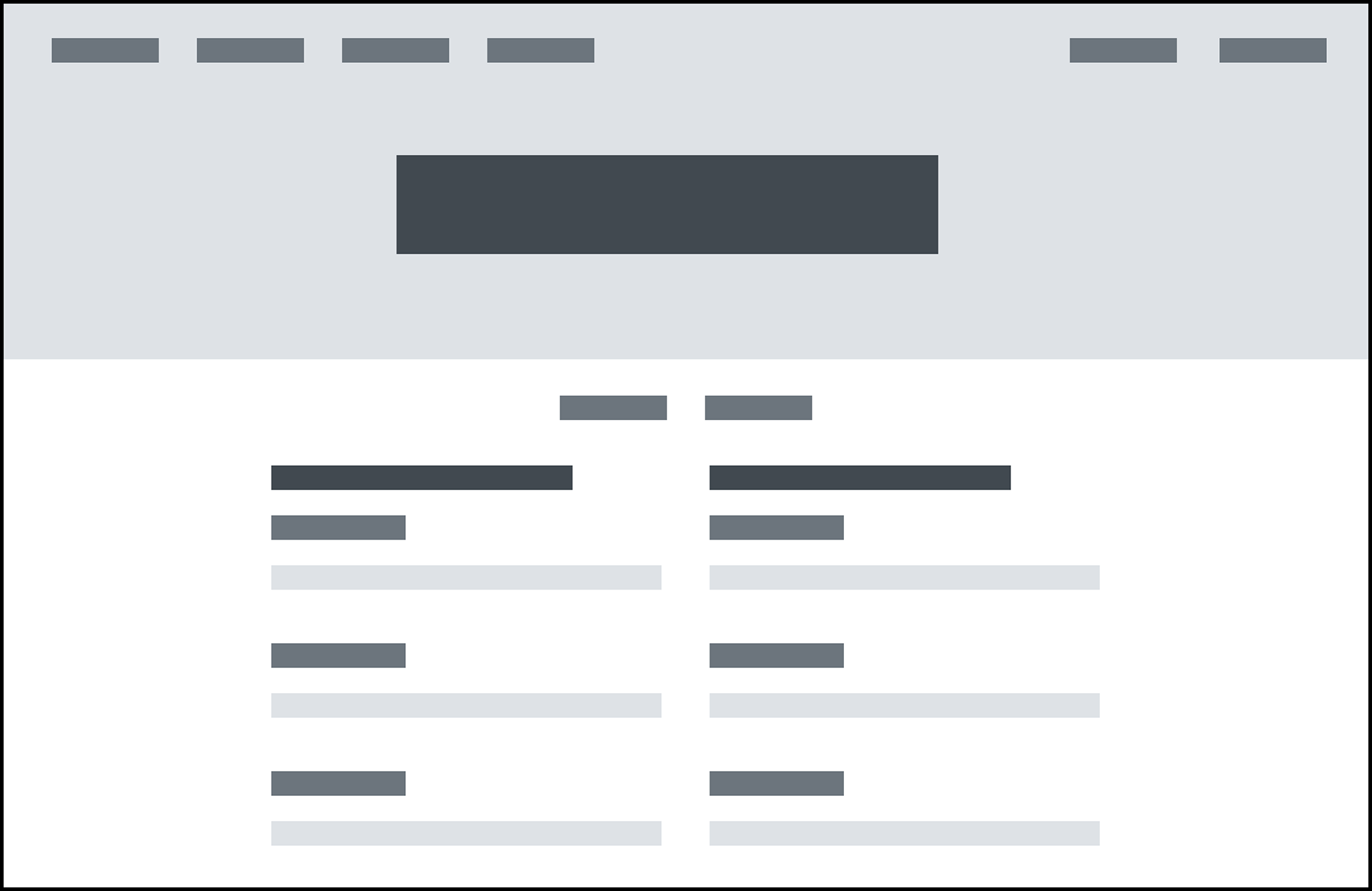
Menu - Lofi
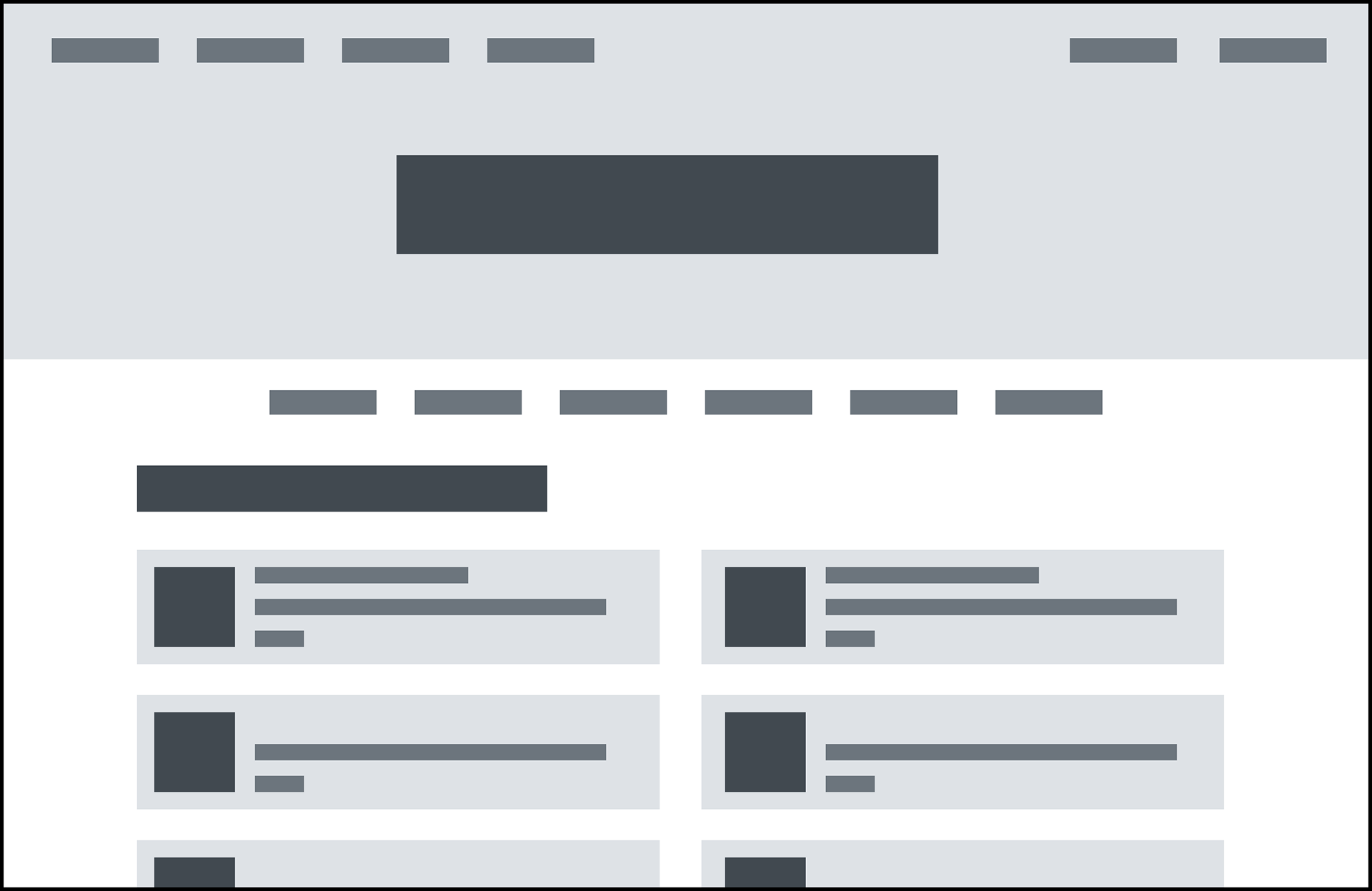
Order - Lofi

Product - Lofi
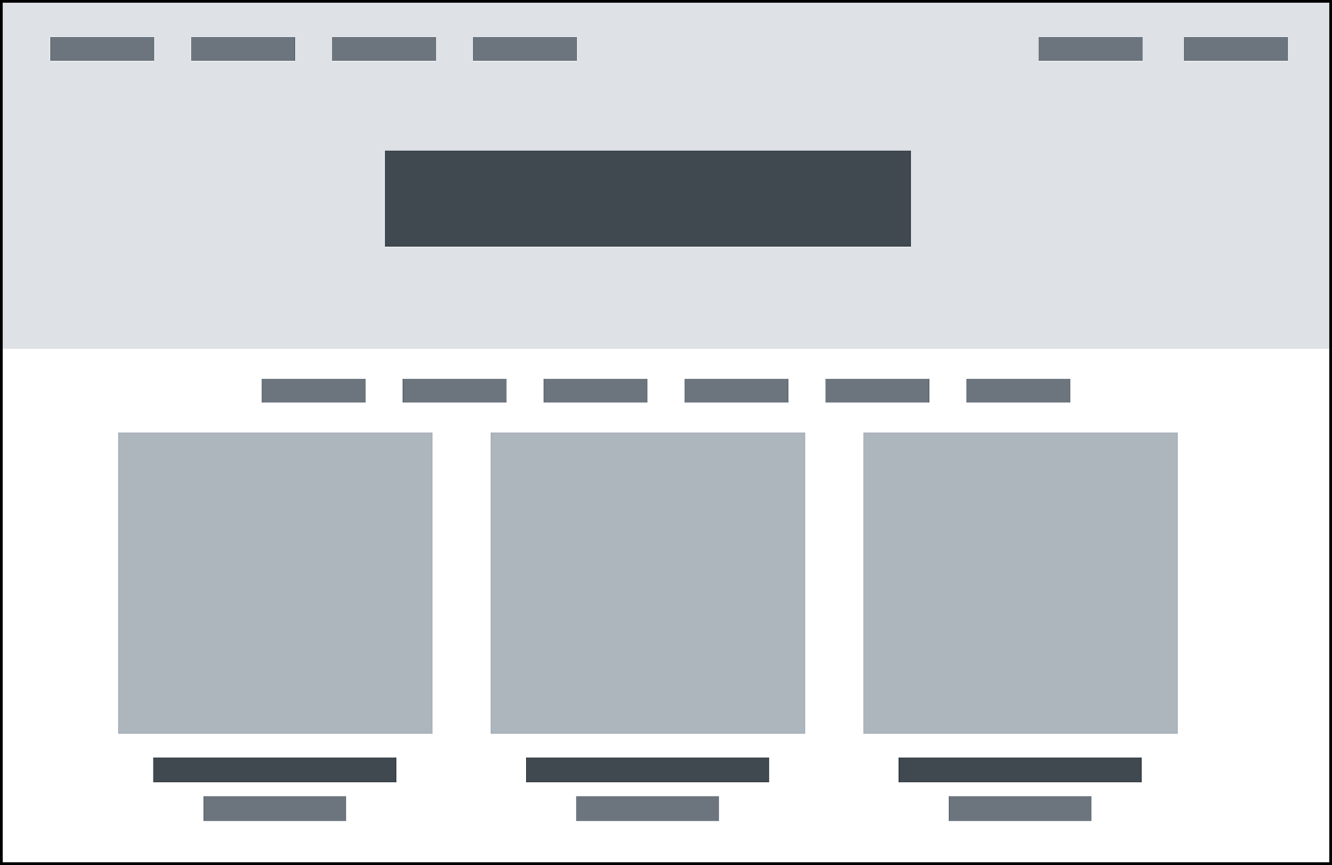
Merch - Lofi

About Us - Lofi
Mid-fidelity
High-Fidelity
USER TESTING
User Test 1: Order a cafe latte with soy milk and two pumps of vanilla.
Response: Users found this task fairly straightforward to complete.
User Test 2: Order the Fat Boy t-shirt.
Response: Users also found this task easy. One user did point out that the flow could benefit from a login/create account vs. check out as a guest feature.
Action Items: Develop screens for users to be able to choose how they checkout.
Iterations
PROTOTYPE
CLOSING
Throughout the process of designing Fat Boy Coffee Co.'s website, I wanted to try my hand at e-commerce and quickly realized the complexity involved, with many steps to consider. In hindsight, I would have approached the design for mobile and desktop more tangentially rather than focusing on one at a time. Moving forward, the next steps include creating contingency screens for different outcomes, such as error messages and loaders, and then progressing to the development phase. I am most proud of the cohesive branding and the consistency achieved between the mobile and desktop versions of the site.

