EVENTFUL
Project Type Responsive Website Design
Role Researcher & Designer
Tools Figma, Adobe Illustrator
The Project
Eventful is a full-service, event planning, responsive app that caters to all experience levels from novice to expert. By determining the largest roadblocks in planning an event, I was able to design a product to help ease the pains that users commonly run into. Throughout the entire UX process, I meticulously conducted research, brainstormed innovative ideas, crafted designs, and rigorously tested the product to ensure its efficacy and user-friendliness.
BACKGROUND
Planning a fun event can be tricky, whether you’re a professional organizing a wedding or an amateur planning a game night. Keeping track of guest lists, food, venues, and everything else can become increasingly overwhelming and may cause coordinators to forget about things
SECONDARY RESEARCH
Quick Facts
•In the US, the event planning industry is worth almost $3.2 million
•Over 40% of planners feel that the technology available to them is not sufficient.
Competitive Analysis
PRIMARY RESEARCH
Questions
•What methods do you use to keep track of your events?
•What is the most difficult part of this method?
•What type of events do you typically plan?
•When do you become the most overwhelmed when planning an event?
•What difficulties do you run into while planning an event?
•Have you ever forgotten about something in the planning process?
Research Synthesis - POV & HMW Statements
I’d like to explore ways to help first-time planners feel more confident and prepared while organizing their party because they worry their event will be a failure.
How might we help planners feel more confident and prepared when planning events for the first time and in the future?
How might we help first-time planners develop good planning habits?
I’d like to explore ways to help stressed planners streamline and automate the planning process because they are so busy they forget about the smaller details.
How might we reduce the stress of planners by streamlining and automating the planning process?
How might we help planners to not forget about smaller details?
I’d like to explore ways to help overwhelmed planners feel more confident about collaborating with others on an event because they are nervous about communication issues.
How might we ease the worries of overwhelmed planners when it comes to collaborating?
How might we develop an efficient and easy way to collaborate with others?
I’d like to explore ways to help professional planners organize various types and sizes of events at the same time because they find it difficult to switch from one event to another.
How might we help planners easily work on different types of events at the same time?
How might we create a way to accommodate different types of events without overwhelming the planners?
User Needs
•Ways to schedule and staff various activities
•Organize budget with automated math
•Multiple lists
•Accommodate different event types and sizes
•Allows for collaboration
•Ways to track guests, RSVPs, plus-ones, meals
•Ways to keep track of vendors and venues + contact information
Pain Points
•Guests can be unpredictable (attendance, during the event, etc.)
•Communication with other planners can become difficult
•It’s hard to know if people will do what they say they will
•Leading up to/right before the event can be overwhelming
•Making sure that everything is ready
•Vendors/venues can be unpredictable as well
•Might not show up or don’t show up on time
Personas
PRIORITIZATION & ROADMAPPING
Project Goals
Features
User Flow
BRANDING
The Eventful design and branding features a modern and sleek aesthetic, utilizing cool colors with pops of warm tones to create a visually appealing and easy-to-read interface. This combination ensures the design is both functional and aesthetically pleasing, providing users with an engaging experience that is easy to navigate and enjoy.
UI & VISUAL DESIGN
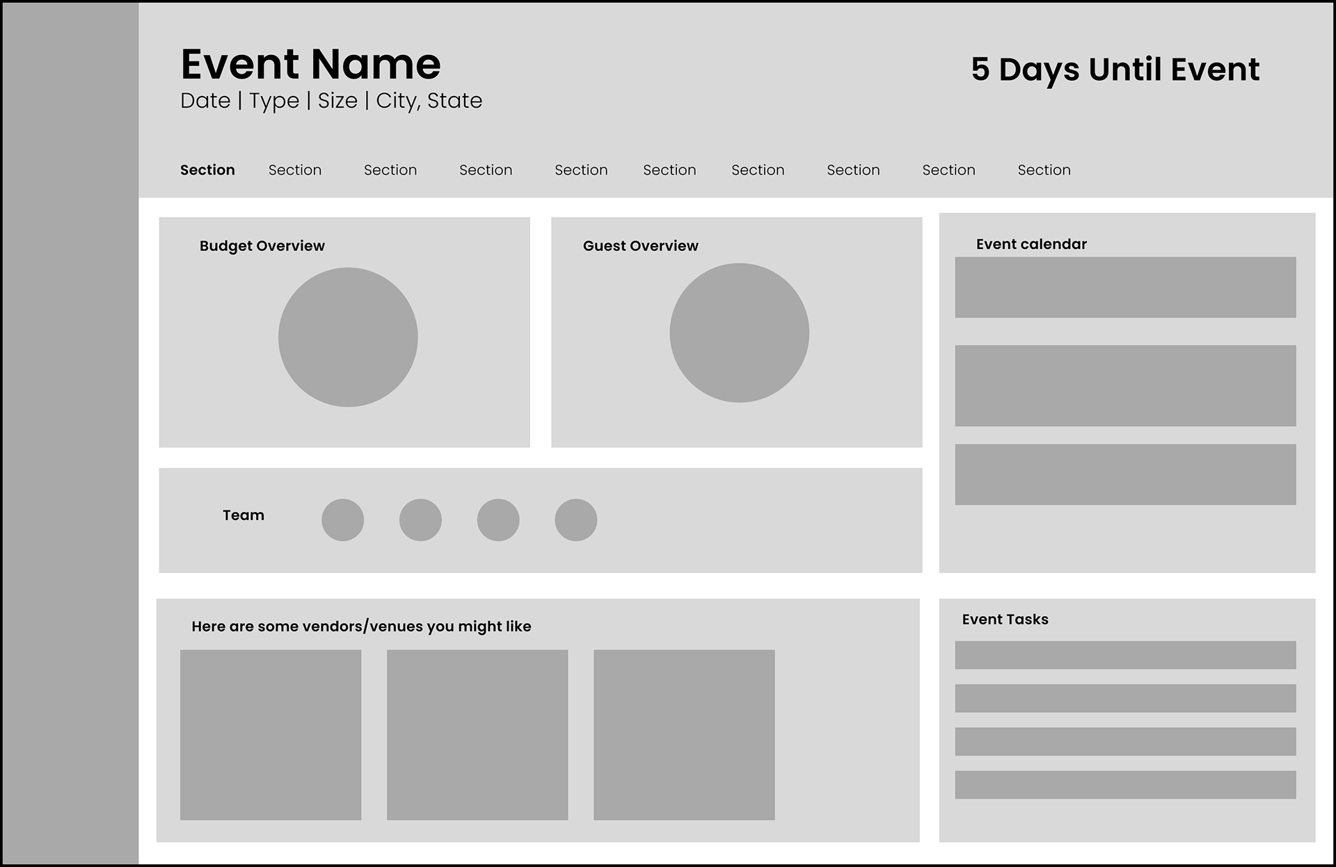
Low-Fidelity
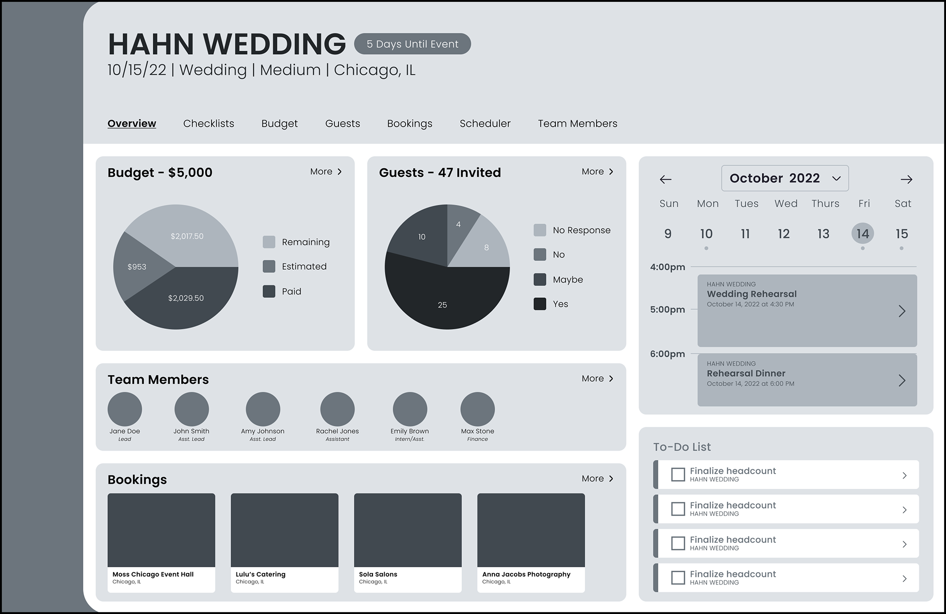
Mid-Fidelity
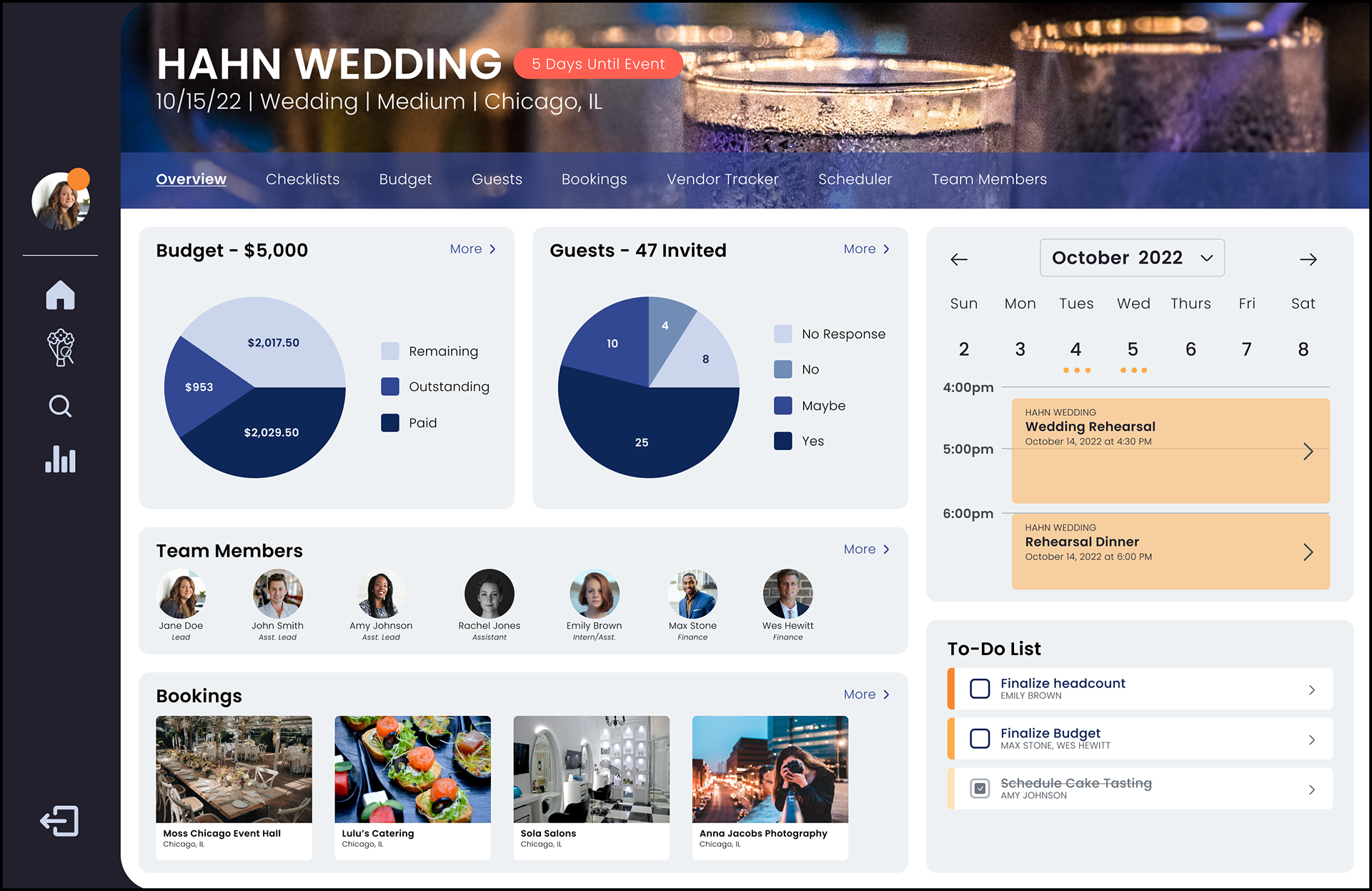
High-Fidelity
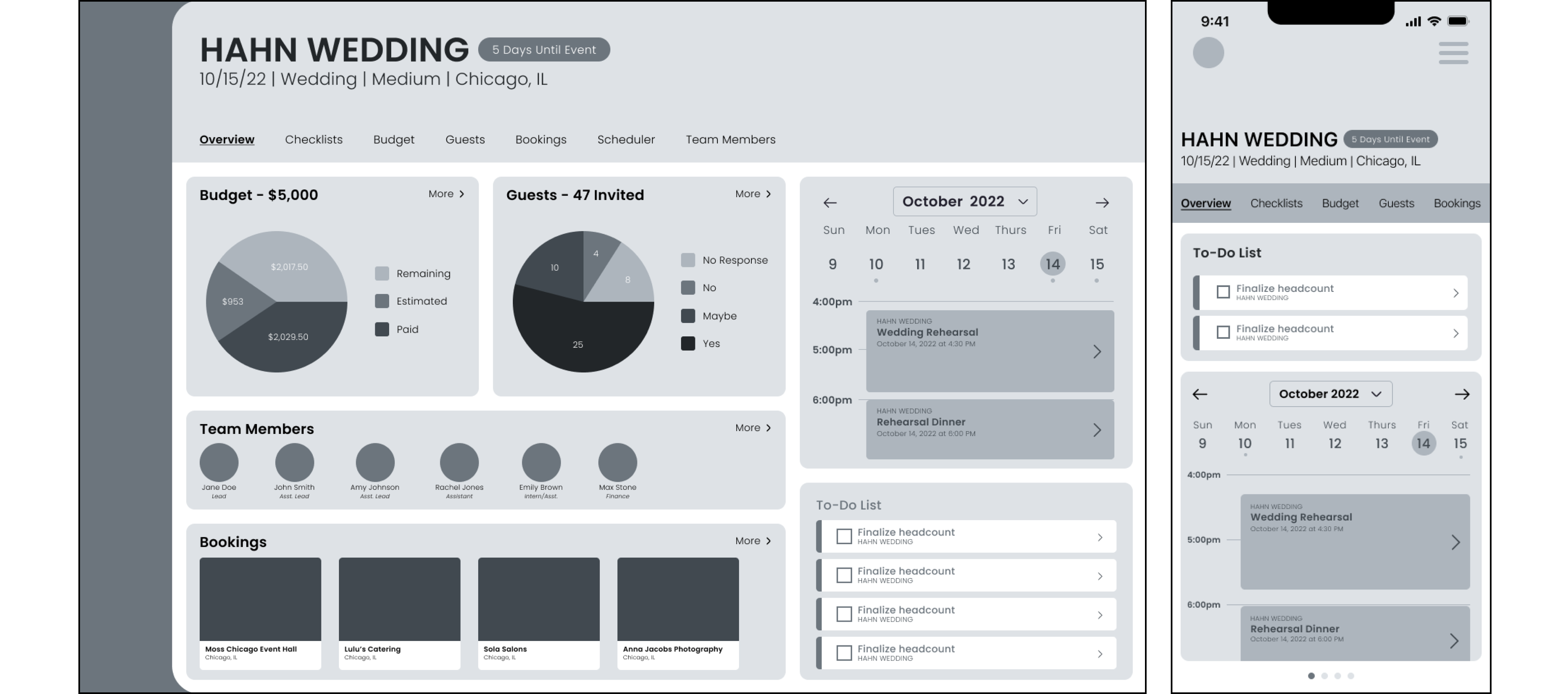
I designed the website as a single frame to avoid scrolling, allowing users to easily see what they are looking for at a glance. To enhance legibility, I made the various sections modular. The overall goal of the design was to ensure that planners could quickly find and access everything they need, even in a fast-paced environment.
UI Kit
WIREFRAMES
Low-fidelity

Dashboard
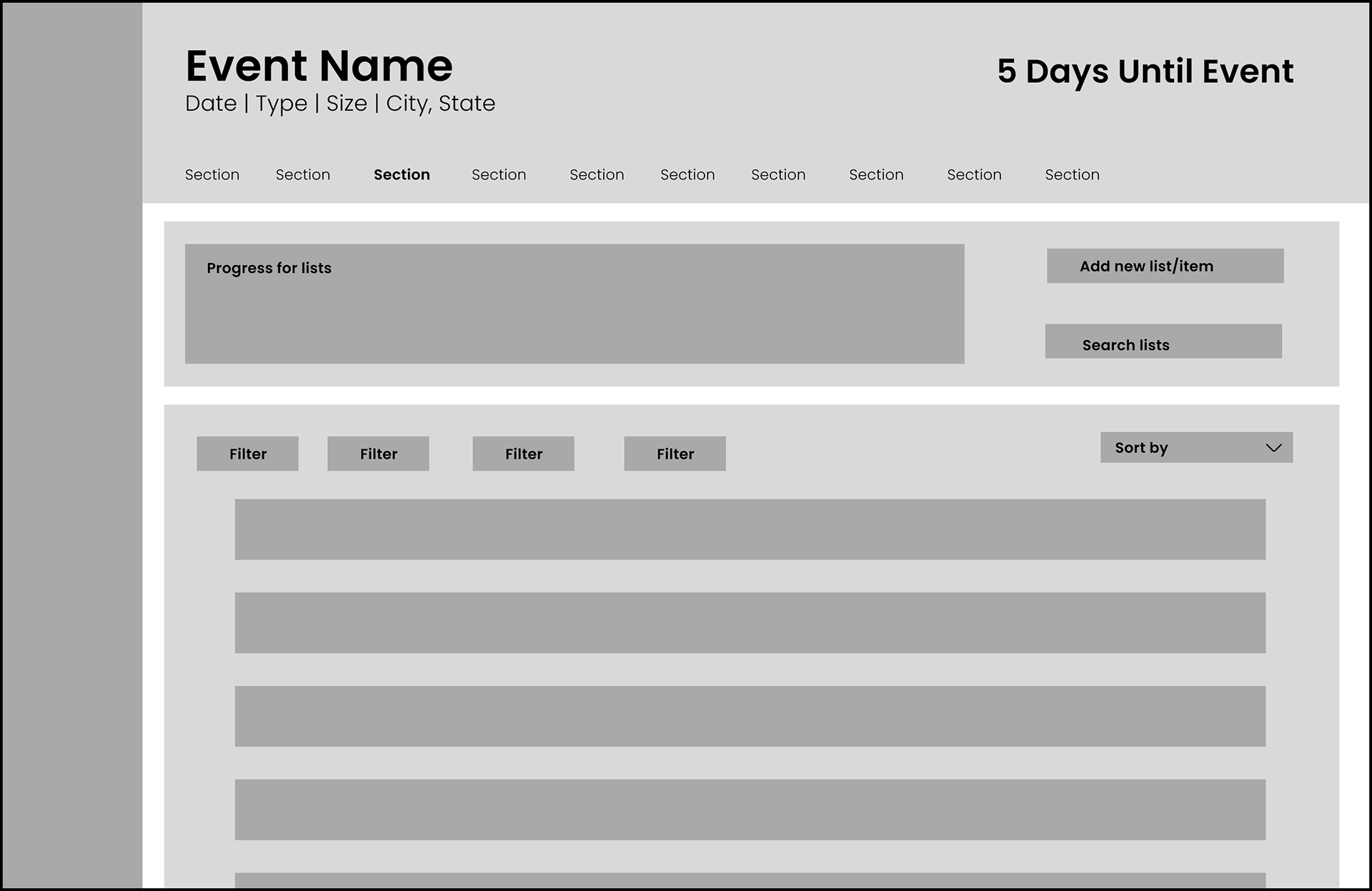
Checklists
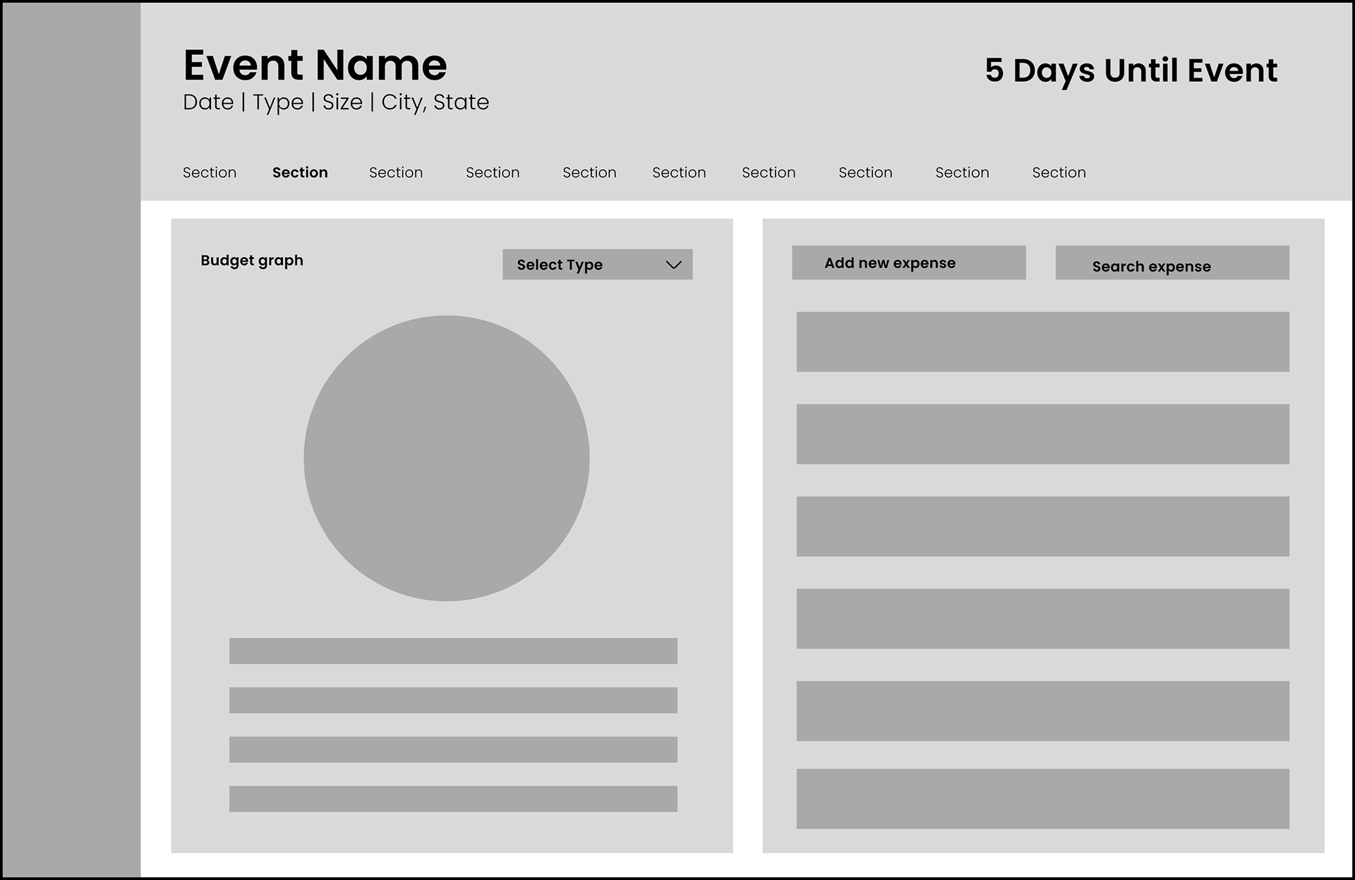
Budget
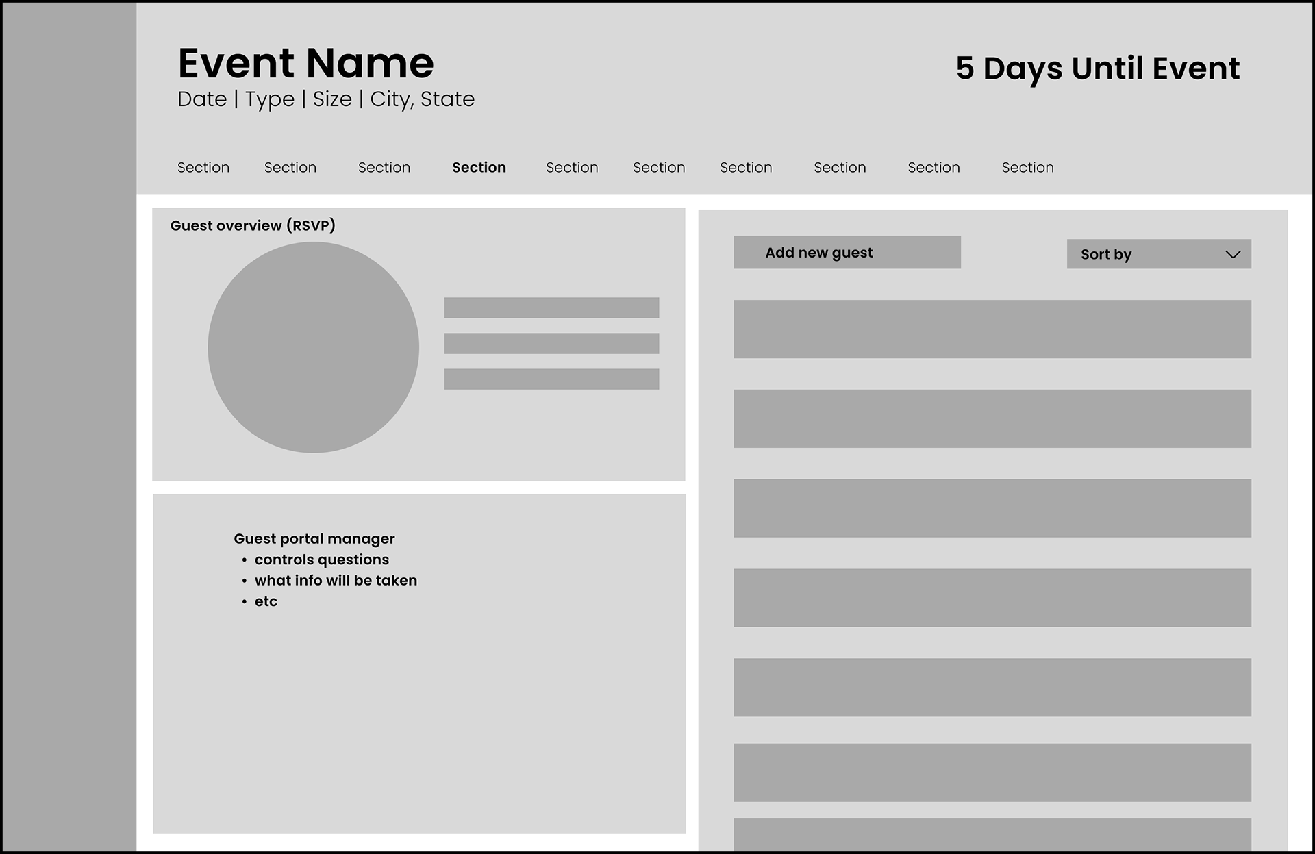
Guests
Mid-fidelity
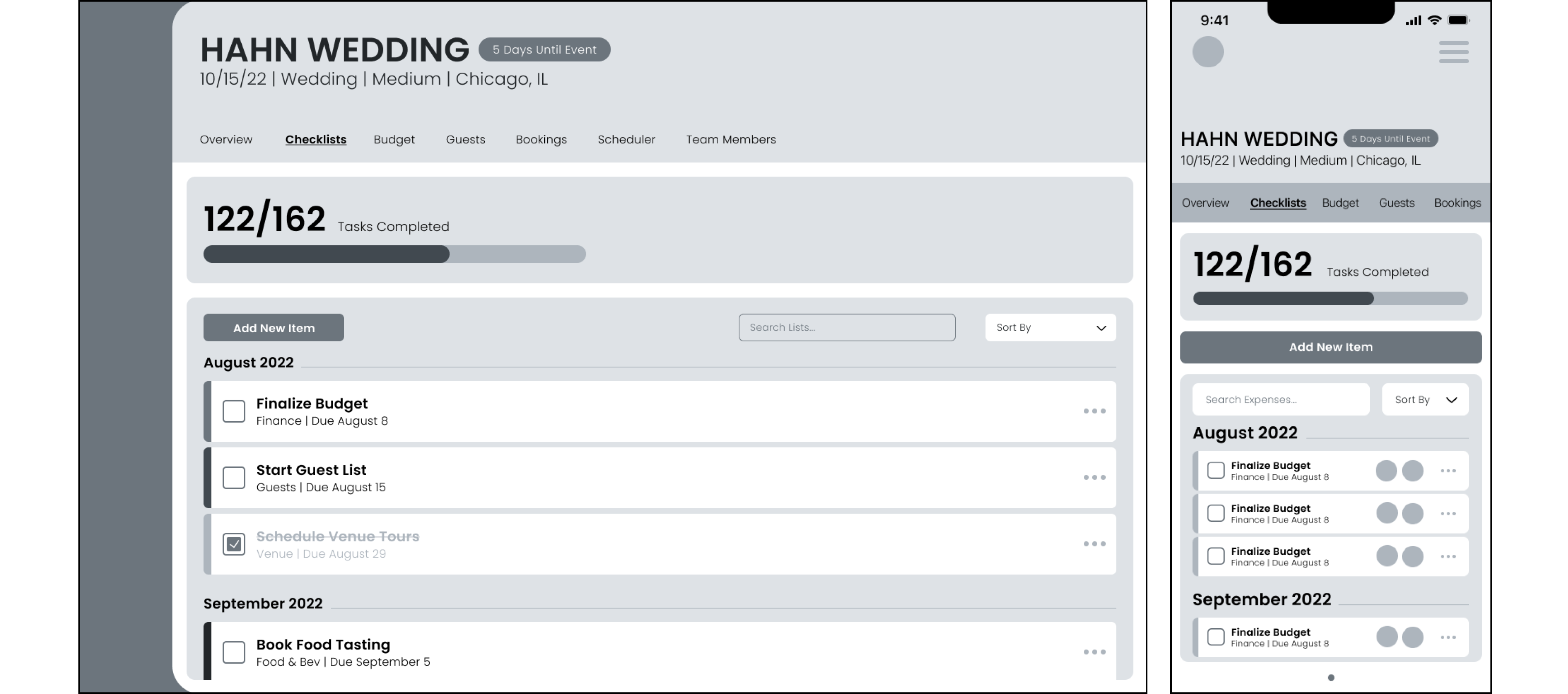
Checklists
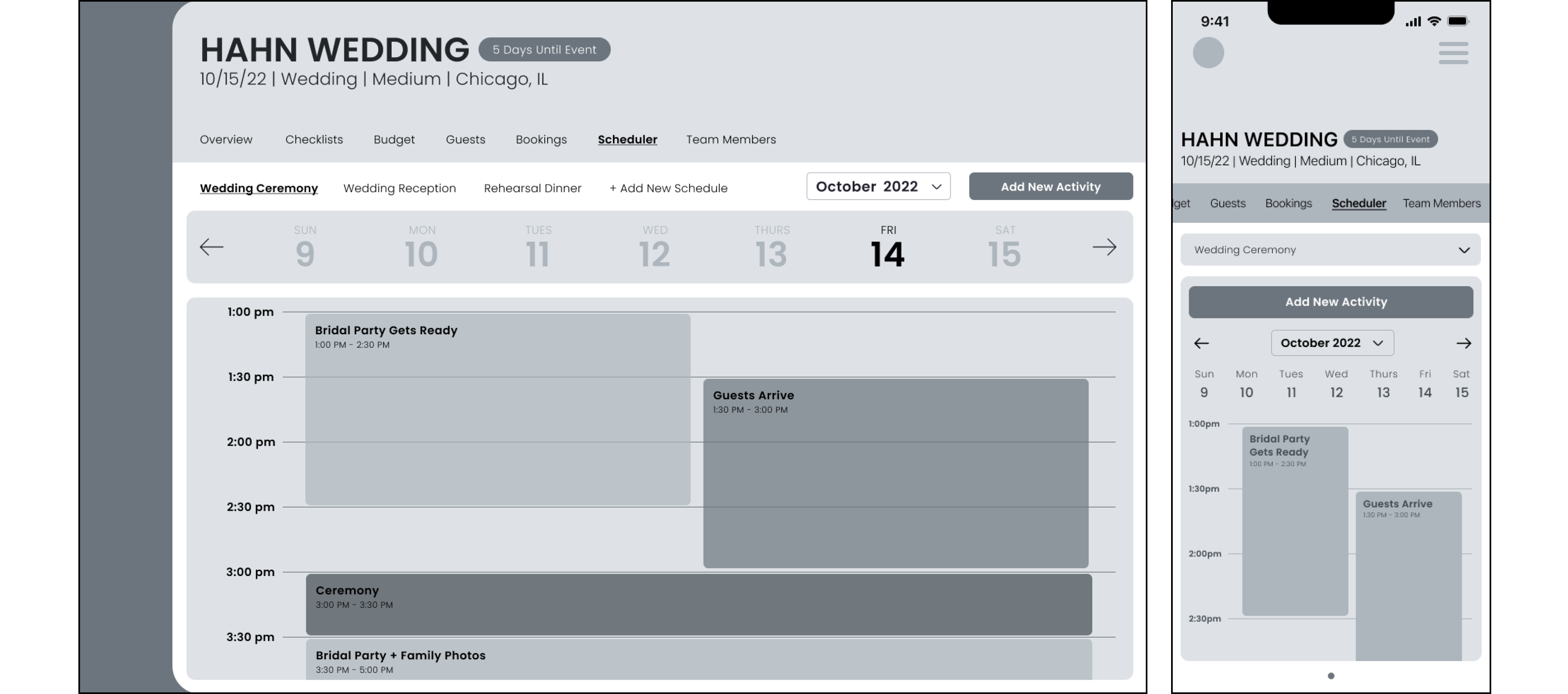
Scheduler
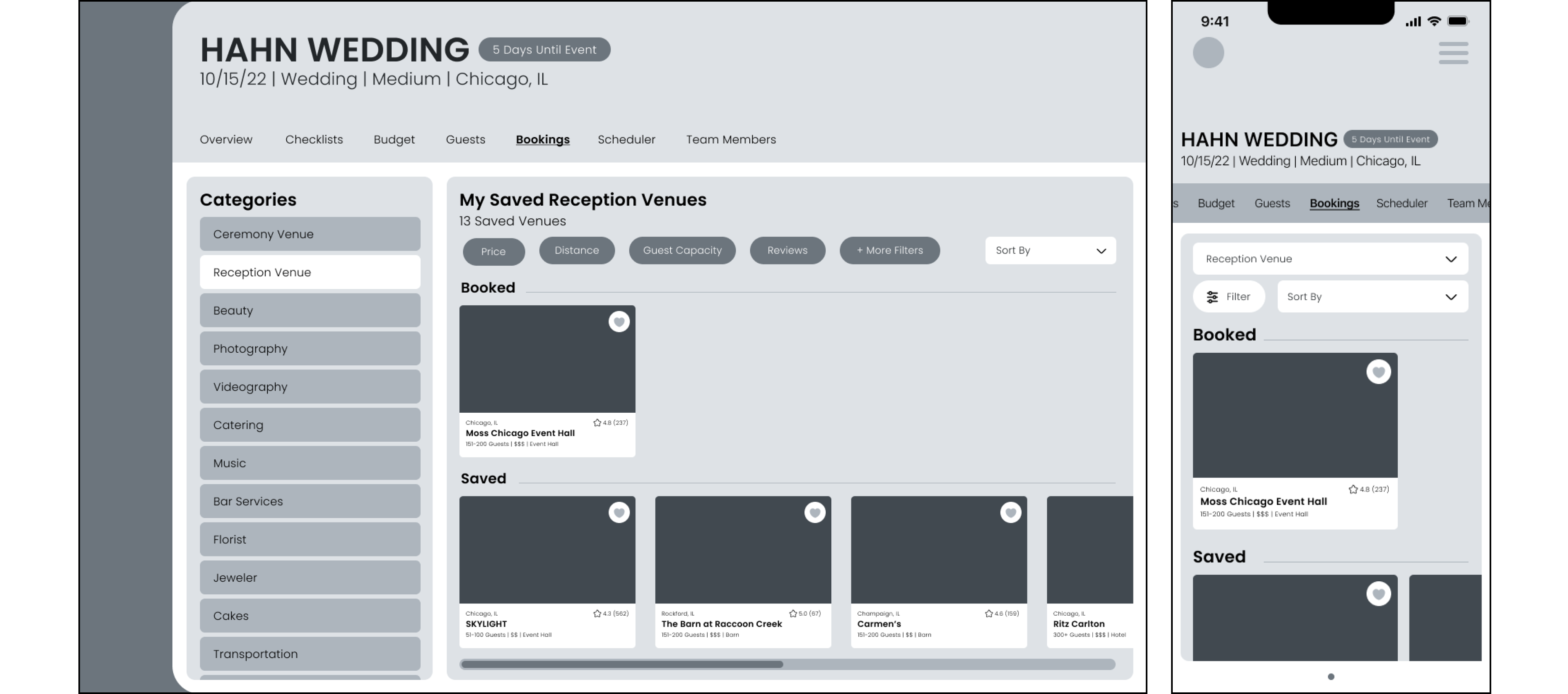
Bookings
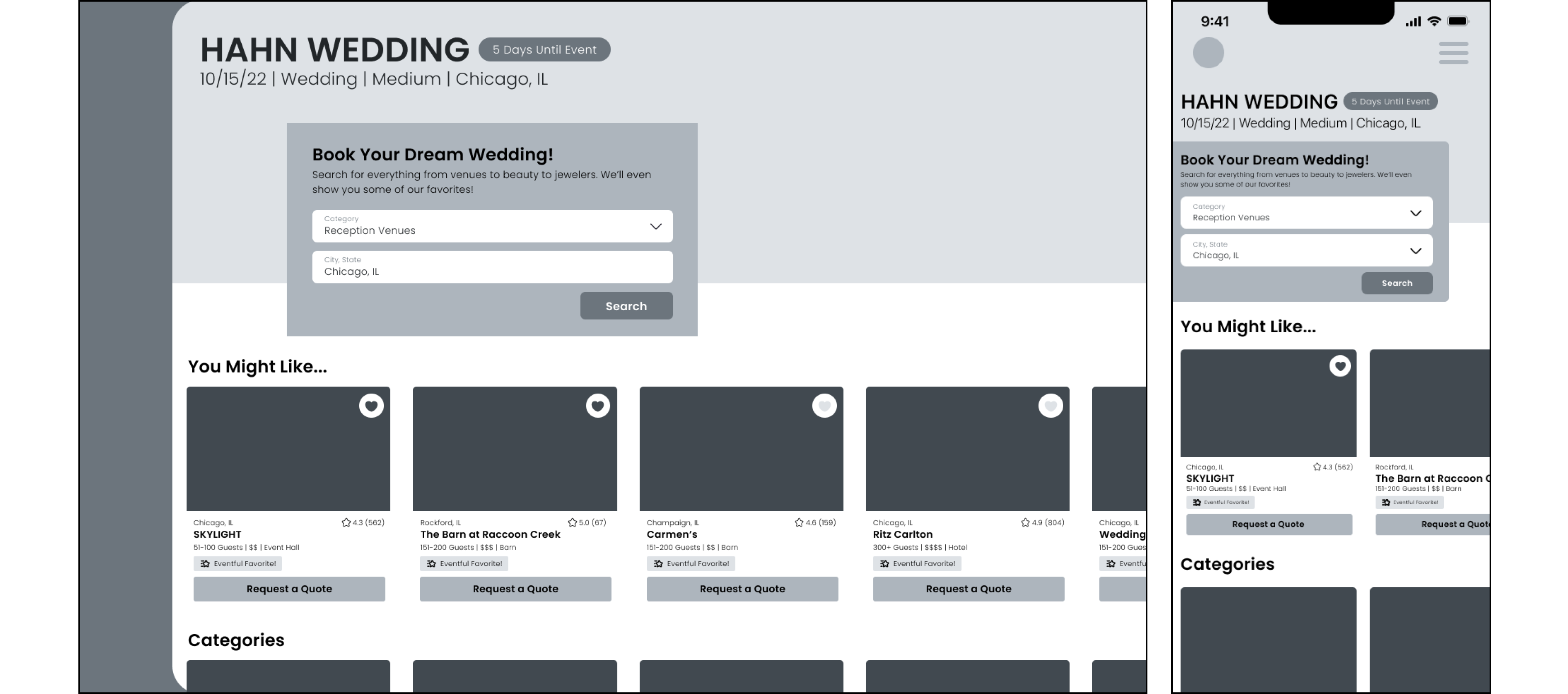
Vendor Search
Dashboard
USER TESTING
User Test 1: Create an account.
Response: Everyone felt that this was straightforward and easy to complete.
User Test 2: Sign in & create a new event.
Response: Majority thought it was easier. One user had trouble completing the ‘create a new event’ task because they were using Maze on mobile. Another struggled with inconsistencies between ‘Sign In’ and ‘Log In.’
Action Items: Make sure the language is consistent across the app.
User Test 3: Add a budget & an expense.
Response: This was the flow that most people struggled with. The overall thought was that it was difficult to find the expenses section. Some users stumbled upon it by accident.
Action Items: Find a way to make it known that users can swipe to find more sections on mobile.
High-Fidelity
CLOSING
Throughout the process, I found it to be a great way to deep dive into the UX process and meticulously work through each step in detail. If I were to do it differently, I might have simplified the design of the website, as it was quite extensive for a first project. Moving forward, the next steps include creating screens for different contingencies and outcomes, such as error screens and loaders, and then progressing to the development phase. I am most proud of the overall design and my ability to accomplish such a large project successfully.

